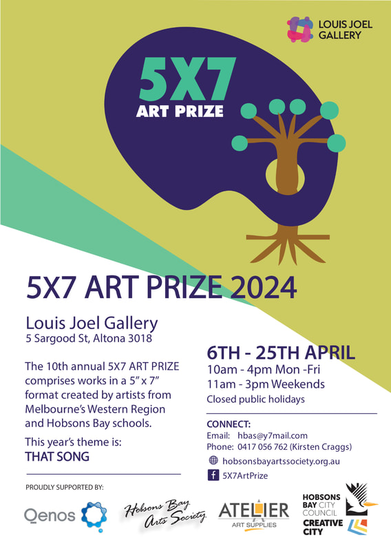
HBAS Exhibitions 2022
Something Special About Here
Our Spring Exhibition this year is called “Something Special About Here” and will contain artwork that
is inspired by our artists’ local spaces. This exhibition is a new one for HBAS and we would love to
encourage the participation of all our members. The entry deadline is Sept 16th. To enter
(up to 2 artworks), use the jotform by clicking here or copy and paste the following into your web browser: https://form.jotform.com/221943663383865
To attend the launch please register at eventbrite by clicking here.
Through The Artist's Eyes
The Through the Artist's Eyes exhibition is held annually in the foyer of the Hobsons Bay City Council. All could visit the exhibition at anytime during the opening hours to view some of our members wonderful artworks. Please see below for a slide show showing all of the works hanging and also some great photos from our opening night. CONGRATULATIONS to Victoria Smith for winning the peoples choice award for her beautiful watercolour work.
Peoples Choice award winner, Cherry Lake by Victoria Smith.
L-R: President of the Hobsons Bay Arts Society Gaye Pereira-Jackson with Peoples Choice winner Victoria Smith.
5x7 Art Prize
The first Hobsons Bay Art Society exhibition for 2022 is the 5x7 Art Prize. This exhibition is open to all residents of the Brimbank, Hobsons Bay, Maribyrnong, Melton, Moonee Valley and Wyndham Municipalities and is an increasingly popular event. The theme for this year is "What Matters" and the exhibition is open to the public to view 10am - 4pm Mon-Fri and 11am - 3pm on weekends from the 9th of April till the 21st of April at the Louis Joel Centre, 5 Sargood Street, Altona, Victoria, 3018. Most artworks are for sale and are a great opportunity to get an original one of a kind artwork for yourself or a great gift.
We would like to thank our judges for this years 5x7 Art Prize - Jeff Gauci, Tania Blackwell and Danielle Whelan for the very hard job they had of picking winners from such a fantastic selection of art. As always thank you to all those who have entered, to our volunteers and sponsors which make this show possible.
Category winners and Judge Comments:
Overall it was incredibly hard to make a decision. The judges were pretty much unanimous in their top six, but working out the order of winners was quite challenging, so everyone should be commended. The judges looked at both skills as well as how well the works responded to the theme of “ What Matters” The judges were delighted with so many works focused on the environment and in the end the award winners were selected based on skill, composition, and their conceptual thinking.

1st Place: You - What Matters by Jacquie Koolan
The judges were all immediately drawn to this work. The techniques used are strong with the layering of paint and lacquer to give the work a 3-dimensional appeal, it’s as though it pops out of the canvas further strengthening its message. The work reminds the viewer to reflect on themselves as being important. With the increasing challenges around mental health, we felt the work responded well to the theme of what matters and presented an important message.

2nd Place: Mismanaged Matter by Debbie Kavanagh
This work created a bit of contention between the judges, in the end, it was awarded a prize for its intelligent narrative. Drawing on the idea of physical matter and minerals that are mined from the landscape to cater to humanity’s overconsumption presented a powerful message as we face an extinction crisis.

3rd Place: Toxic Ocean - "The Hand of Man Series" by Deborah Chubb
The judges liked all three of the works in the series. Toxic Ocean stood out for its relevance to the Bay with the message of the plastic ocean consuming the whale as a metaphor for our dying ocean. The human hand-holding and carrying the bag, reminds us that we are in control of the ocean's destiny.

Highly Commended: No More War by Leanne Pagliaro
The judges liked the three works in this series. They all presented a strong message about peace and having currency based on what is happening in the Ukraine. The illustrations showed a lot of emotion through light and shade.

Highly Commended: Water Play Matters by Cara King
The judges liked the skill in this work, the use of light, and its painterly technique really stood out. The work suggests a love for family and the ocean.

Highly Commended: What Matters - Precious Water by Gaye Pereira-Jackson
This work captured the judge's attention with its subtle pointillism technique. The message of water being such an important asset is often taken for granted. The expression on the child's face is of gratitude which we felt was also an important message of what matters.
Please enjoy below a slide show of all the entries to our open section of the 5x7 Art Prize
Please enjoy below a slide show of all the entries to our school section of the 5x7 Art Prize
Congratulations to the award winners in the school section:
1st Place - Queen Of Peace Primary School
2nd Place - Williamstown High School - Bayside
3rd Place - Williamstown Primary School
1st Place - Queen Of Peace Primary School
2nd Place - Williamstown High School - Bayside
3rd Place - Williamstown Primary School
Previous Recent Exhibitions
Learning Curve 3rd Dec - 17th Dec 2021
The Learning Curve exhibition is held every year to showcase the work of those who attend Hobsons Bay Art Society classes and social art groups. Each group/class member was invited to submit up to two works, this year due to covid closures work completed at home during lockdown was also able to be submitted. The exhibition is displayed below with a short summary of the group followed by a gallery of submitted work. This year it is being held online only but you can still buy works that are for sale (these will have a price after them. Most works are unframed check with artist before purchase.) Please contact the society via email to purchase - hbas@y7mail.com
Please enjoy the exhibition of works by our talented group/class members:
On Location with Nancy

Nancy hosts a very popular sketching group which meets at Louis Joel before relocating in the Pier Street area of Altona to capture likenesses of local people and scenes.
A very relaxed and social group enjoyed by all who attend.
Artful Dabblers

A group that gets together to create and be inspired in a friendly, supportive atmosphere. You can paint, draw, do textile or paper craft or try something new - the choice is yours!
Gaye's Social Painting Group

A friendly untutored Social Painting Group meets at the Louis Joel to create together.
BYO materials for any medium. Create and have a cuppa!
Dynamic Drawing in Mixed Media with Hans Van Weerd

Classes exploring new avenues in drawing/painting from a variety of sources of inspiration while working towards maintaining a dynamic quality to the work; capturing the moment and showing it as part of a continuum. Various medias explored including pencil, charcoal, inks, pastel/conte crayons, watercolour, gouache and acrylics.
Watercolour with Ted Dansey

Ted loves watercolour and enjoys demonstrating during every class showing his students the planning and technique required as he follows his motto "keep it simple".
Lessons explore all type of subjects with a special focus on landscape and streetscapes.
We hope you enjoyed the exhibition.
Thank you to all participants.
The Hobarchies 24th Sept - 7th Oct:
Thank you very much to artist and long time supporter and sponsor of the Hobsons Bay Arts Society Trudi Harley for judging the Hobarchies and for her insightful critiques of the prize winners. If you would like to learn more about Trudi and see some of her amazing work including portraits Click Here to go to her website.
Category winners and Judge Comments:
Comments by Hobarchies 2021 judge Trudi Harley:
As with any judging of art work is difficult to leave personal preference aside and remain objective, and as such it is also difficult to merely choose something that is a ‘winner’ over something else. I commend all the artists in their achievements in executing their chosen portrait whether it be of the human or animal variety, and to the extent to which their accomplishments have been met. It has been a very trying time and as always artistic endeavours allow us a form of escapism, an indulgence into self-reflection which takes us away from the everyday. I encourage all of you to think past winning or losing and simply think of this as an artistic journey, a place where you can share your thoughts and wallow in a little pictorial relief.
Portraits:

1st Place - Kathryn Price- Self Portrait
Beautifully executed portrait using a limited palette, thoughtful presence of the sitter gazing upward in contemplation. Simplicity of form and space conjures up a sense of isolation and almost hopelessness, but at the same time providing a deep sense of inner strength. Depth is created by soft tonal variations with light gently illuminating the sitter’s left side and throwing the right into gentle shadow. Very effective use of the medium.

2nd Place – Michele Tirman Olsen – Vivienne Westwood
Expressive portrait accurately capturing the sitter’s features and characteristics. Bold colour emphasises Vivienne’s personality.

3rd Place - Elke Metzger – Julie Bishop as Foreign Minister
Beautifully stylized portrait of Julie Bishop, no nonsense portrayal of the Ex-Foreign Minister using clean cut simple lines and black and white contrast to create form and emphasise depth of character.

Honourable Mention – Linda Goonan – Isolation – Grumpy Girl
Sombre portrait accurately portrays the sitter with thoughtful use of evocative colour. Expressive application of line and texture emphasising the current mood of lockdown and providing the viewer with the foreboding sense of hopelessness.

Honourable Mention – Judith Jones – Daphne at the Window
Simplistic form accentuated with lively confident brushstrokes. Thoughtful use of colour which emphasises the separateness of the external environment to the internal environment. Unusual viewpoint to create a sense space to and depth.
Pets/Wildlife Portraits:

1st Place – Kirsten Craggs – Pepin
Effective use of the medium to create space and formulate a sense of depth. Textural elements of fur confidently and expressively executed. Good contrast of colour elements to emphasise the subject matter.

2nd Place – Stella Kinsella – Blue
A beautiful and expressive characterisation which fully engages the viewers’ attention. The intense fixated gaze is endearing making it almost impossible to look away.

3rd Place – Kathryn Price – Berger Paddy
Emotive pet portrait, engaging in its simplicity, fully enclosed within the picture frame it still provides a sense of openness, so much so that the cat looks at us with disdain and could at any moment stand up and walk off.

Honourable Mention – Ivana Pinaffo – The Two Of Us
Very expressive brush stroke and lively strong sense of colour application to suggest form and space. Spatial and colour relationships operate to create depth of field.

Honourable Mention – Michele Finey – Cormorants of Australia
A well thought out piece where the detail of the elements is reduced to stylization. The expressive nature of the cormorant’s beaks leading us directionally over the painting. Reduction of colour to create depth in the landscape.
Through the Artist's Eyes
Held in the foyer of the Hobsons Bay Civic Centre. After Covid causing the cancellation of the exhibition last year it will be wonderful to see our members work once again on display in this lovely space. Click Here to see a slide show of the opening night and set up of the exhibition. Click Here to see the the full exhibition as a slide show.